POSTED : March 6, 2015
BY : Concentrix Catalyst

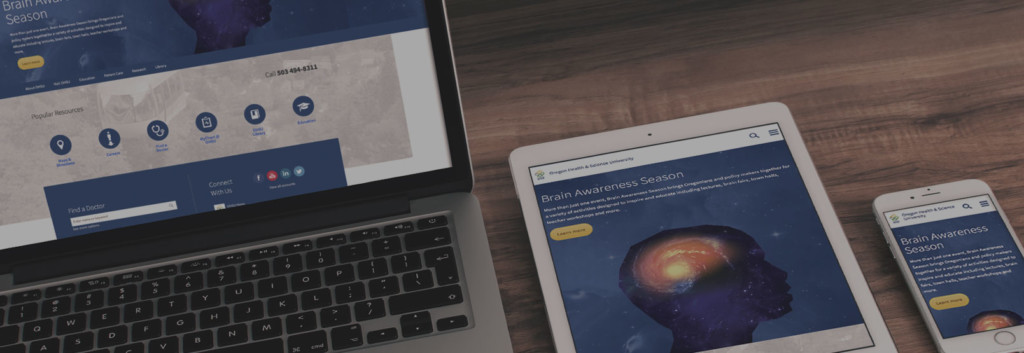
Oregon Health & Science University (OHSU) is a regional leader in healthcare, academic and research programs, with a digital ecosystem as sprawling as its Portland, Oregon campus. Like most organizations, they’ve seen mobile website traffic steadily climb. Almost 40 percent of home page views and a third of all traffic was coming from phones and tablets. The nine-year-old site simply couldn’t deliver the type of responsive web experience that mobile visitors needed—and have come to expect.
Renee McKechnie, Director of Digital Strategy for OHSU, saw this as an opportunity to not only refresh the website and make it responsive but to address other opportunities as well. The goal was to take a forward-looking approach in updating the user experience and design with a new home page, new fonts and styles, more white space to improve readability, and a new header, among other design enhancements.
Beyond the practical issues of making the content easier to view and navigate on a small screen, the site needed to evolve to reflect the true nature of what OHSU now represents: a cutting edge academic medical center that’s changing the landscape of health. And it needed to serve a diverse set of audiences: patients, referring providers, researchers, students… the list goes on. And each comes with a unique set of expectations, needs and goals.
A responsive redesign was no small task — from either a technical standpoint or an organizational one. OHSU’s vast digital ecosystem spans more than 300 websites and roughly 30,000 pages of content across more than 200 departments and more than 1,000 content owners. Not used to shrinking from a challenge of any kind, the OHSU team decided to have every one of those sites and pages go live with the new, responsive design at once on launch day.
There was only one way this could be achieved: Get all the right stakeholders and contributors involved from the start and carefully orchestrate their collaboration throughout the process. Representatives from each of the major areas of the organization formed an advisory panel to ensure status and messaging were communicated evenly and that questions and feedback had a direct route in, as well.
It’s not uncommon for an organization to outsource wholesale an initiative this large, complex and strategically important. But it’s rarely the ideal long-term approach. And it’s not the OHSU way.
As OHSU’s digital agency of record for more than a decade, Concentrix Catalyst has collaborated with OHSU on dozens of digital initiatives and, at this point, it feels like we’re a seamless part of the OHSU team. So we sat down at the outset of the site refresh initiative to plan and map out how to most effectively collaborate so that the combined team would be greater than the sum of its parts.
We made sure the OHSU team was not only actively involved throughout every phase of the project but also capturing all the rationale, the knowledge gained, and lessons learned along the way. And vice versa. By partnering with trust and transparency, our team was able to do better work more efficiently and gain knowledge that informs more great collaborations in the future.
Did the project go off without a single hitch? Absolutely not. But none of the issues encountered were major, and we found our way over the speed bumps and around the obstacles. One thing we all agreed on in our post-project review session was that the problems we did encounter could have been mitigated or prevented with still more transparency and frank communication.
The fact is, though, the project, including QA and launch, was remarkably smooth and well-executed when it could have been anything but. One OHSU team member said that in 15 years of digital projects, this was the smoothest she’s seen QA go.
And the launch? We all felt confident as we approached go live, but I don’t know if any one of us could honestly say we expected it to go as smoothly as it did. Sure, there were a few content issues discovered in the hours and days following launch as content and sub-site owners did their reviews. But advance planning meant most of these issues were fixed within hours of being submitted, and none were showstoppers.
Both OHSU and Catalyst brought seasoned teams of knowledgeable, skilled professionals to this initiative. We couldn’t have achieved the success of a responsive website we did—across many different measures—without that. But it was the openness, communication and spirit of cooperation that made it not only successful but enjoyable.
Many of us have had the experience of working with or for an organization that not only worked within rigid, opaque silos internally but walled off their outside partners, as well.
In some cases it seems to be driven by a desire to maintain a perceived upper hand through knowledge hoarding and power plays. In other cases, it may be because the organization or key stakeholders had a bad experience with an outside partner previously.
In any case, nobody wins. The lack of trust and transparency means that all parties are operating with a subset of the information needed and only a partial picture of reality.
Fortunately for us, the spirit of learning, collaboration and service excellence with which OHSU approaches everything they do is generously extended to their professional partnerships as well.
Tags: Design, Experience Design, Healthcare, Mobile, Strategy